FAQ
Understanding the SENSBLACK template
As you can see, the SENSBLACK template includes all new elements as well as some manual code in openElement.
To avoid new users getting lost, we provide this FAQ. By default, this page is marked "noindex" to avoid referencing by search engines.
NEW ELEMENTS
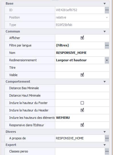
Let's start with the new element called Responsive Group of Elements, aka Responsive Panel.
Example - the top of the homepage:
To avoid new users getting lost, we provide this FAQ. By default, this page is marked "noindex" to avoid referencing by search engines.
NEW ELEMENTS
Let's start with the new element called Responsive Group of Elements, aka Responsive Panel.
Example - the top of the homepage:
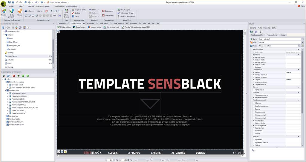
What is it for? This element takes the entire height and width of your browser page. So, whatever the screen size, the Panel will adapt to it.
We have included various options that take into account the widest range of cases :
 BEHAVIOR
Minimum distance :
This is the minimal space between the bottom of the Responsive Elements Panel and the internal content. This corresponds to the bottom inside margin of the Container style area (go to Styles, Customization). This part may include units in pixels, em, vh etc..
Minimum high distance :
This is the minimal space between the top of the Responsive Elements Panel and the internal content. This corresponds to the bottom inside margin of the Container style area (go to Styles, Customization). This part can include the unit in pixels, em, vh etc.
Include footer height :
It is useful to check this box for the last panel of the page. As soon as possible, reduce the height so that the footer (the Bottom Content section) enters the screen with the panel.
Include header height :
It is useful to check this box for the first panel of the page. As soon as possible, reduce the height so that the Header (the Top section if activated in the Page Sections - Responsive icon) returns to the screen with the panel.
Include element heights :
You can add a list of comma-separated IDs, items that should appear on the same page (screen) as the responsive items panel. The height of the panel will be reduced accordingly. This is what we did with our element WEMENU (a panel of elements). This one takes into account the height of this element and is inscribed perfectly there.
Once this element is imported on your page, if you want centered content inside, you must put a Group of Elements (standard element in the Elements list on the right) inside. This will inherit automatically from a specific oerp-inner-content class. DO NOT REMOVE it, otherwise you will lose horizontal and vertical centering. Inside this element panel, you can either put yourself in relative (what we advise for the development of a website in reponsive) or in absolute. Optionally you can add some other elements around this inner Group - navigation arrows, anchor to scroll to this place on clicking a link, etc.
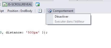
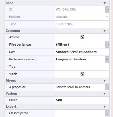 The next item is the Smooth Scroll to Anchors item.
Once placed on a page or a layer (which is our case), you will automatically have a smooth scroll on clicking a link to an anchor placed anywhere on your page. In the element, you can adjust the scrolling speed in milliseconds. This also works on links to elements' IDs.
For our template, we specified "500", which is the default value.
We have included various options that take into account the widest range of cases :
BEHAVIORMinimum distance :
This is the minimal space between the bottom of the Responsive Elements Panel and the internal content. This corresponds to the bottom inside margin of the Container style area (go to Styles, Customization). This part may include units in pixels, em, vh etc..
Minimum high distance :
This is the minimal space between the top of the Responsive Elements Panel and the internal content. This corresponds to the bottom inside margin of the Container style area (go to Styles, Customization). This part can include the unit in pixels, em, vh etc.
Include footer height :
It is useful to check this box for the last panel of the page. As soon as possible, reduce the height so that the footer (the Bottom Content section) enters the screen with the panel.
Include header height :
It is useful to check this box for the first panel of the page. As soon as possible, reduce the height so that the Header (the Top section if activated in the Page Sections - Responsive icon) returns to the screen with the panel.
Include element heights :
You can add a list of comma-separated IDs, items that should appear on the same page (screen) as the responsive items panel. The height of the panel will be reduced accordingly. This is what we did with our element WEMENU (a panel of elements). This one takes into account the height of this element and is inscribed perfectly there.
Once this element is imported on your page, if you want centered content inside, you must put a Group of Elements (standard element in the Elements list on the right) inside. This will inherit automatically from a specific oerp-inner-content class. DO NOT REMOVE it, otherwise you will lose horizontal and vertical centering. Inside this element panel, you can either put yourself in relative (what we advise for the development of a website in reponsive) or in absolute. Optionally you can add some other elements around this inner Group - navigation arrows, anchor to scroll to this place on clicking a link, etc.
The next item is the Smooth Scroll to Anchors item.Once placed on a page or a layer (which is our case), you will automatically have a smooth scroll on clicking a link to an anchor placed anywhere on your page. In the element, you can adjust the scrolling speed in milliseconds. This also works on links to elements' IDs.
For our template, we specified "500", which is the default value.
The next item is Sticky (sticky) on Scroll. It is used on the Base_Menu layer. We have developed this element to allow a menu (according to its ID) to remain fixed at the top once it has arrived there during a scroll.
The different options:
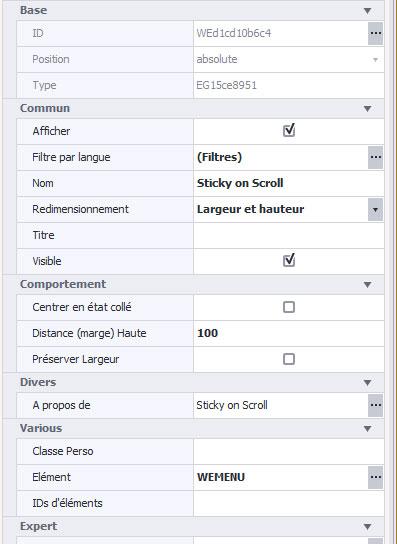 Center in glued state: still in beta test.
Top Distance (margin): Apply a margin of xx pixels from the top. No need to play with.
Preserve Top: still in beta test.
Element: This is the target element to stick on scroll. In our case, WEMENU - once it arrives at the top of your browser during the scroll, it will remain fixed.
Element IDs: You can add multiple elements, separated by a comma.
Custom Class: You can specify a class then set it in the Custom Classes property of each target element.
The different options:
Center in glued state: still in beta test.Top Distance (margin): Apply a margin of xx pixels from the top. No need to play with.
Preserve Top: still in beta test.
Element: This is the target element to stick on scroll. In our case, WEMENU - once it arrives at the top of your browser during the scroll, it will remain fixed.
Element IDs: You can add multiple elements, separated by a comma.
Custom Class: You can specify a class then set it in the Custom Classes property of each target element.
TEMPLATE STRUCTURE
BASE LAYERS
The template consists of several essential layers in order to simplify the workflow (layers are grouped in the Layers node of the Site Explorer on the left). Here are the basics. First, we created a layer called "Base" that contains only blocks of manual source code and the "Up" arrow button.
The CSS block :
Its function is to bring a latency (fade in and fade out) on elements having either different colors or different images mouseover. This brings an animated transition on each element.
To benefit from this functionality, you must add the class transitions to your elements (using the Custom Classes property).
The HTML block :
It includes only the code "meta" to manage the viewport (management according to media queries and mainly the mobiles).
The code blocks HTML-JS-.... :
Activate the appearance animation on any item that has the apply-smoove class. Only one of its blocks must be active; To do this, click once in the code block on the Behavior icon above the block and enable / disable it. (See the Disable option).
CSS-BT-TOP and JS-BT-TOP :
Contains CSS and JS code concerning the button that appears at the bottom-right of your browser when you start scrolling down.
PRELOADER
We have developed a layer called "preloader". This layer handles only one thing, animation when loading the page. It contains no elements but only 3 codes souce (one CCS, one JS and one HTML). You have nothing to change if you plan to use it as is. For those who want to change the loading view, find an animated gif that suits you and rename it "preloader". Save it in the library to replace the old one. Its current size is 250 pixels by 250 pixels. To change it, go to the CSS code block of the layer and change the width and height values.
The code in question :
#status {
width:250px;
height:250px;
position:absolute;
left:50%; /* centers the loading animation horizontally one the screen */
top:50%; /* centers the loading animation vertically one the screen */
background-image:url(Files/Image/preloader.gif); /* path to your loading animation */
background-repeat:no-repeat;
background-position:center;
margin:-100px 0 0 -100px; /* is width and height divided by two */
}
If you do not want to use this layer, to disable it, simply go to the Base_Menu or Base_Menu_Alt layers and change their layer by Base to no longer benefit from the preloader layer.
LAYER BASE_MENU
The Base_Menu layer is the main layer of the home page (index). This "inherits" the preloader layer. If you do not want animation to load the page, change it to Basic (it is necessary for all other layers and pages).
This layer contains no blocks of source code but only custom elements.
Its content consists of the menu mainly as well as a background color.

The structure is very simple to allow you to modify it smoothly.
Each button has a width set to Auto and margins in %. This allows to adapt according to the size of your browser. One of the elements of this menu is also hidden on the standard resolution. You can find it crossed out it in the Element Explorer on the bottom-left:
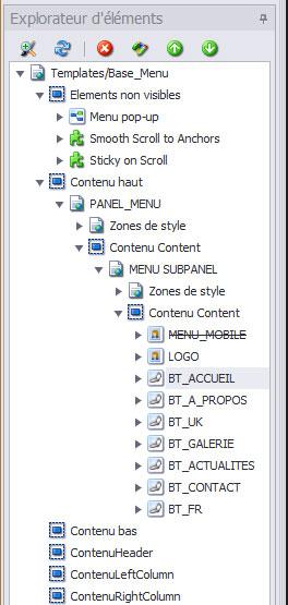 It's the WEMENU_MOBILE element. This allows you to familiarize yourself with new key openElement functionality - media queries.
This element will be visible in the Editor only when you change resolution with Edit media (see the button on the top of the page): 800px resolution (tablets [portrait] and smartphones).
In addition, you can see 3 other elements that make up this layer.
This is the pop-up menu item. It is only used for tablet and mobile versions. It is connected directly to the WEMENU_MOBILE icon. If you change the names of your menu, consider going there to change the names. Each link in the pop-up menu refers to an anchor in the page. Like that, no link error.
The layer also uses the Smooth to Anchor element. We have explained to you above what this element corresponds to but it allows to specify to each link that returns to an anchor or an ID to see a fluid scroll. It is set to 500 milliseconds (the element's default value).
The other element on the layer is the Sticky element (sticky) to the scroll. As mentioned above, it forces the item to remain pasted at the top of the page when the scroll reaches it.
Some functions may be tested if you want to change the template default settings.
THE HOME PAGE
The first part of the home page is the Responsive element panel. It is associated with the Base_Menu layer.
This takes into account the WEMENU element of the layer. We have integrated it into these functions so that it is at the bottom of the element if you preview it.
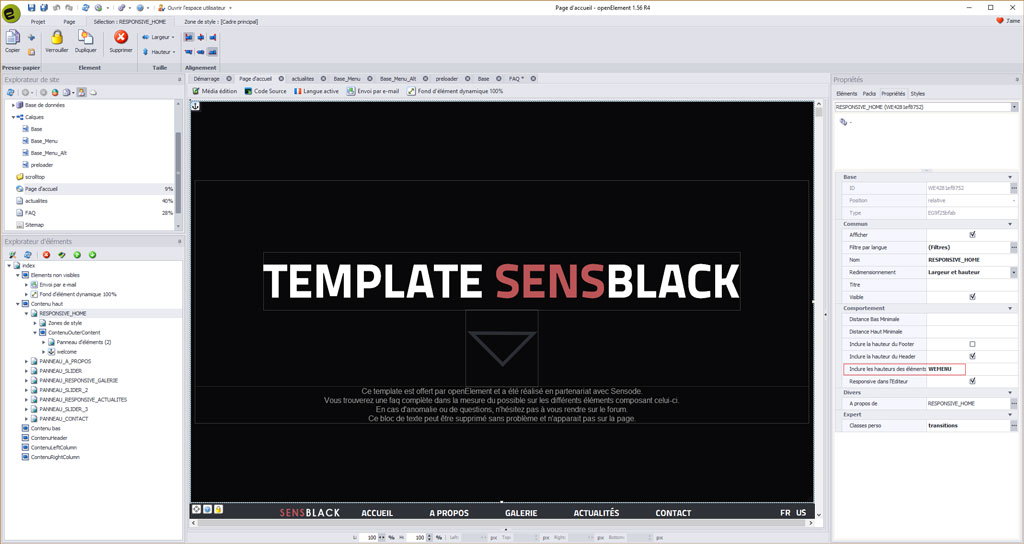
You can delete the text block in the center without any problem, it is there to give you some practical information. The central image scrolls back to the next part with the apply-smoove class.
You can easily change this image and modify the effects according to your choice (with any photo editing software for hover and click colors).
The responsive element panel also has a linked element. This is the Dynamic Element Background element 100%.
Click on it (at the top of the home page) to open it if you want to change the images.
You will also see on the right the menu for the various settings.
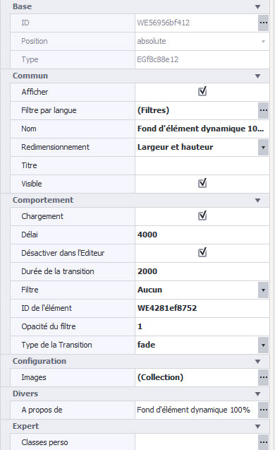 Loading: checked by default. Preload images. To let.
Delay: This is the time in milliseconds between each image during the slide.
Disable in the editor: checked by default. It can allow you to see directly in OE.
Duration of the transition: Duration of the effect in milliseconds; 0 to disable transitions.
Filter: allows to place different filters on the top of the images.
Item ID: If nothing is specified, this applies to the entire page. We have therefore indicated the ID of the element of the responsive element panel.
Opacity of the filter: set a value between 0 and 1 for the effects of the selected filter.
Transition type: a wide range of transitions. By default it is set to fade.
Images: Here you can edit the photos in the collection.
The second part is the ABOUT section.
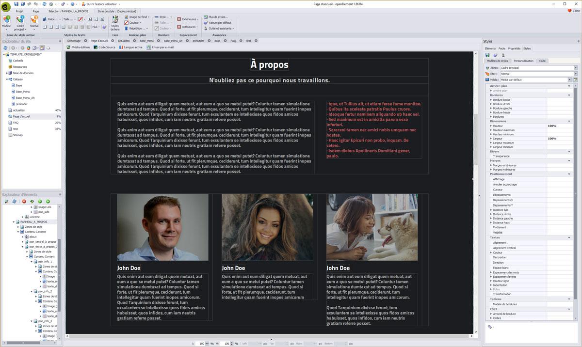
It consists mainly of panels of classical elements and multi-line text blocks. One of the parts to be mastered is that of the photos. We have incorporated a shade of white color with a opacity to 70% from the start on the picture. This opacity disappears in the air. To change / remove this opacity, select the item, and in the right menu, change the Main Frame area to Content (Expert).
You will then have access to opacity which is 70 by default and 99 to flyover. To change the color Black. By default, you just select the item, to be in Main Frame and change the background color (which is black in the template). We also incorporated specific parameters directly into the element to force the images to be round.
To access the settings, you must go to the right menu (of course after selecting the image), the Styles tab, then Customize. The overrun should be hidden and all rounded edges should be set to 50%. This will not be visible in Openelement but in preview and once online.
On the other hand, you must respect a constraint: the images must be perfectly square. Otherwise, you may end up with an oval image.
BASE LAYERS
The template consists of several essential layers in order to simplify the workflow (layers are grouped in the Layers node of the Site Explorer on the left). Here are the basics. First, we created a layer called "Base" that contains only blocks of manual source code and the "Up" arrow button.
The CSS block :
Its function is to bring a latency (fade in and fade out) on elements having either different colors or different images mouseover. This brings an animated transition on each element.
To benefit from this functionality, you must add the class transitions to your elements (using the Custom Classes property).
The HTML block :
It includes only the code "meta" to manage the viewport (management according to media queries and mainly the mobiles).
The code blocks HTML-JS-.... :
Activate the appearance animation on any item that has the apply-smoove class. Only one of its blocks must be active; To do this, click once in the code block on the Behavior icon above the block and enable / disable it. (See the Disable option).
CSS-BT-TOP and JS-BT-TOP :
Contains CSS and JS code concerning the button that appears at the bottom-right of your browser when you start scrolling down.
PRELOADER
We have developed a layer called "preloader". This layer handles only one thing, animation when loading the page. It contains no elements but only 3 codes souce (one CCS, one JS and one HTML). You have nothing to change if you plan to use it as is. For those who want to change the loading view, find an animated gif that suits you and rename it "preloader". Save it in the library to replace the old one. Its current size is 250 pixels by 250 pixels. To change it, go to the CSS code block of the layer and change the width and height values.
The code in question :
#status {
width:250px;
height:250px;
position:absolute;
left:50%; /* centers the loading animation horizontally one the screen */
top:50%; /* centers the loading animation vertically one the screen */
background-image:url(Files/Image/preloader.gif); /* path to your loading animation */
background-repeat:no-repeat;
background-position:center;
margin:-100px 0 0 -100px; /* is width and height divided by two */
}
If you do not want to use this layer, to disable it, simply go to the Base_Menu or Base_Menu_Alt layers and change their layer by Base to no longer benefit from the preloader layer.
LAYER BASE_MENU
The Base_Menu layer is the main layer of the home page (index). This "inherits" the preloader layer. If you do not want animation to load the page, change it to Basic (it is necessary for all other layers and pages).
This layer contains no blocks of source code but only custom elements.
Its content consists of the menu mainly as well as a background color.
The structure is very simple to allow you to modify it smoothly.
Each button has a width set to Auto and margins in %. This allows to adapt according to the size of your browser. One of the elements of this menu is also hidden on the standard resolution. You can find it crossed out it in the Element Explorer on the bottom-left:
It's the WEMENU_MOBILE element. This allows you to familiarize yourself with new key openElement functionality - media queries.This element will be visible in the Editor only when you change resolution with Edit media (see the button on the top of the page): 800px resolution (tablets [portrait] and smartphones).
In addition, you can see 3 other elements that make up this layer.
This is the pop-up menu item. It is only used for tablet and mobile versions. It is connected directly to the WEMENU_MOBILE icon. If you change the names of your menu, consider going there to change the names. Each link in the pop-up menu refers to an anchor in the page. Like that, no link error.
The layer also uses the Smooth to Anchor element. We have explained to you above what this element corresponds to but it allows to specify to each link that returns to an anchor or an ID to see a fluid scroll. It is set to 500 milliseconds (the element's default value).
The other element on the layer is the Sticky element (sticky) to the scroll. As mentioned above, it forces the item to remain pasted at the top of the page when the scroll reaches it.
Some functions may be tested if you want to change the template default settings.
THE HOME PAGE
The first part of the home page is the Responsive element panel. It is associated with the Base_Menu layer.
This takes into account the WEMENU element of the layer. We have integrated it into these functions so that it is at the bottom of the element if you preview it.
You can delete the text block in the center without any problem, it is there to give you some practical information. The central image scrolls back to the next part with the apply-smoove class.
You can easily change this image and modify the effects according to your choice (with any photo editing software for hover and click colors).
The responsive element panel also has a linked element. This is the Dynamic Element Background element 100%.
Click on it (at the top of the home page) to open it if you want to change the images.
You will also see on the right the menu for the various settings.
Loading: checked by default. Preload images. To let.Delay: This is the time in milliseconds between each image during the slide.
Disable in the editor: checked by default. It can allow you to see directly in OE.
Duration of the transition: Duration of the effect in milliseconds; 0 to disable transitions.
Filter: allows to place different filters on the top of the images.
Item ID: If nothing is specified, this applies to the entire page. We have therefore indicated the ID of the element of the responsive element panel.
Opacity of the filter: set a value between 0 and 1 for the effects of the selected filter.
Transition type: a wide range of transitions. By default it is set to fade.
Images: Here you can edit the photos in the collection.
The second part is the ABOUT section.
It consists mainly of panels of classical elements and multi-line text blocks. One of the parts to be mastered is that of the photos. We have incorporated a shade of white color with a opacity to 70% from the start on the picture. This opacity disappears in the air. To change / remove this opacity, select the item, and in the right menu, change the Main Frame area to Content (Expert).
You will then have access to opacity which is 70 by default and 99 to flyover. To change the color Black. By default, you just select the item, to be in Main Frame and change the background color (which is black in the template). We also incorporated specific parameters directly into the element to force the images to be round.
To access the settings, you must go to the right menu (of course after selecting the image), the Styles tab, then Customize. The overrun should be hidden and all rounded edges should be set to 50%. This will not be visible in Openelement but in preview and once online.
On the other hand, you must respect a constraint: the images must be perfectly square. Otherwise, you may end up with an oval image.
The third part is the GALLERY section.
We have developed a special element, the Image Swipebox element. This element comes from the JS Swipebox plugin. It is a responsive gallery suitable for all formats. Its use has been simplified so that any gallery is possible.
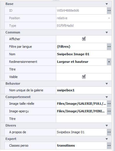 Gallery's unique name:
This is the default name. All new Image Swipebox elements will have the same gallery name. That is, all images will be in one gallery. If you want to create different galleries, simply change the name of the galleries.
Full size image:
This is the maximum zoom image you want to have. By default, avoid exceeding 1280 pixels in width.
Image-overview:
If you want thumbnail images that are smaller (lighter) than full-size images, you need to specify the thumbnail image. Use if needed.
Title:
You can assign a caption for each image.
As you can see, we put a personal transitions class on each image.
The fourth part is the NEWS section.
Nothing complicated on this section of the most classic. The links of each article refer to the news page. To change the links, double-click the "read more" button and click on the top icon Create. You will find the corresponding link. You can even specify the desired anchors.
The fifth and last part is the CONTACT section.
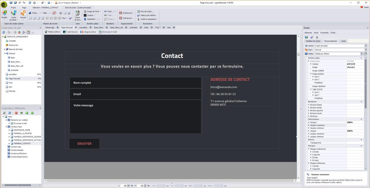
The main element panel has the apply-smoove class only (animated appearance when scrolling).
The only new feature is text entry fields (single and multi-line). We added the default-text class. This class has the characteristic of erasing the text entered by default and when a visitor clicks inside the element, it erases and keeps the new text filled.
IMPORTANT:
Remember to change the recipient of the mail "Sending by email", both on the home page and the News page.
We also insert the googlemap element. To modify it, simply select the element and then click on the second icon at the bottom left of it (adjustable wrench). You will be able to put the code of your GoogleMap coordinates.
The icons of the social networks do not have links informed, it will be enough to put yours.
The "up" button is displayed on the scroll; The corresponding element is on the layer "Base", as well as some blocks of code necessary for its operation.
Slider with parallax effect
Between each section, we have integrated an element panel and placed a voluntarily larger image in height. We have developed an element (at least one function) dedicated to parallax.
What is parallax, then?
If the name is sophisticated, the concept is simple: basically, the image or texture that is in the background scrolls slower (or faster) than the rest of the page. Think of it: if "first-row" objects move faster than those "at the bottom" of the screen, this gives the illusion of a certain depth, close to 3D. In addition, this effect, combined with other techniques, can really breathe life into a website.
For this, we imported the Parallax safe element:
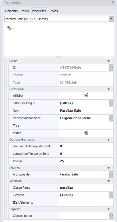
Height of the background image:
(Optional) You can specify the exact height of the background image to speed up the calculations and correct display. Otherwise, the value will be calculated automatically.
Width of the background image:
(Optional) You can specify the exact width of the background image to speed up the calculations and the correct display. Otherwise, the value will be calculated automatically.
speed:
The relative speed in % between 0 and 200. Example: 0 - the image does not move on scroll; 50 - the image scrolls half as fast as the page; 100 - the scroll will be identical to the rest of the other elements. At 200, the scroll will be 2 times faster.
Personal Class:
By default "parallax" but you can change it if you wish. Interesting in case you want to put parallax effects to other elements and vary the scrolling speeds. Rather than using a class, you can directly choose an element to apply the parallax to.
Once your parameters are finished, put the parallax class in the element panel (or else if you have changed the class in the element).
Hopefully this first faq will allow you to better appreciate and use the template that we developed in partnership with openElement and Sensode.
The entire openElement team would like to thank you.
We have developed a special element, the Image Swipebox element. This element comes from the JS Swipebox plugin. It is a responsive gallery suitable for all formats. Its use has been simplified so that any gallery is possible.
Gallery's unique name: This is the default name. All new Image Swipebox elements will have the same gallery name. That is, all images will be in one gallery. If you want to create different galleries, simply change the name of the galleries.
Full size image:
This is the maximum zoom image you want to have. By default, avoid exceeding 1280 pixels in width.
Image-overview:
If you want thumbnail images that are smaller (lighter) than full-size images, you need to specify the thumbnail image. Use if needed.
Title:
You can assign a caption for each image.
As you can see, we put a personal transitions class on each image.
The fourth part is the NEWS section.
Nothing complicated on this section of the most classic. The links of each article refer to the news page. To change the links, double-click the "read more" button and click on the top icon Create. You will find the corresponding link. You can even specify the desired anchors.
The fifth and last part is the CONTACT section.
The main element panel has the apply-smoove class only (animated appearance when scrolling).
The only new feature is text entry fields (single and multi-line). We added the default-text class. This class has the characteristic of erasing the text entered by default and when a visitor clicks inside the element, it erases and keeps the new text filled.
IMPORTANT:
Remember to change the recipient of the mail "Sending by email", both on the home page and the News page.
We also insert the googlemap element. To modify it, simply select the element and then click on the second icon at the bottom left of it (adjustable wrench). You will be able to put the code of your GoogleMap coordinates.
The icons of the social networks do not have links informed, it will be enough to put yours.
The "up" button is displayed on the scroll; The corresponding element is on the layer "Base", as well as some blocks of code necessary for its operation.
Slider with parallax effect
Between each section, we have integrated an element panel and placed a voluntarily larger image in height. We have developed an element (at least one function) dedicated to parallax.
What is parallax, then?
If the name is sophisticated, the concept is simple: basically, the image or texture that is in the background scrolls slower (or faster) than the rest of the page. Think of it: if "first-row" objects move faster than those "at the bottom" of the screen, this gives the illusion of a certain depth, close to 3D. In addition, this effect, combined with other techniques, can really breathe life into a website.
For this, we imported the Parallax safe element:
Height of the background image:
(Optional) You can specify the exact height of the background image to speed up the calculations and correct display. Otherwise, the value will be calculated automatically.
Width of the background image:
(Optional) You can specify the exact width of the background image to speed up the calculations and the correct display. Otherwise, the value will be calculated automatically.
speed:
The relative speed in % between 0 and 200. Example: 0 - the image does not move on scroll; 50 - the image scrolls half as fast as the page; 100 - the scroll will be identical to the rest of the other elements. At 200, the scroll will be 2 times faster.
Personal Class:
By default "parallax" but you can change it if you wish. Interesting in case you want to put parallax effects to other elements and vary the scrolling speeds. Rather than using a class, you can directly choose an element to apply the parallax to.
Once your parameters are finished, put the parallax class in the element panel (or else if you have changed the class in the element).
Hopefully this first faq will allow you to better appreciate and use the template that we developed in partnership with openElement and Sensode.
The entire openElement team would like to thank you.